Colour Correction-Stephen Calcutt
November 4, 2013 § Leave a comment
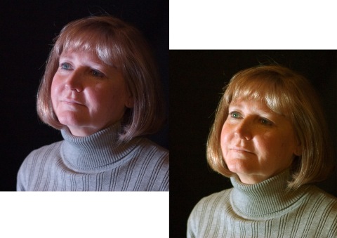
The image on the left is a stock image that I was given for the colour correction exercise.
Firstly i went to the window drop down menu at the top of the screen, opened up the histograms page and looked at each individual colour. This showed that the image had more blue than green or red.
i opened the curves tab, this created a layer in the layers tab, I moved this layer above my image. I then dragged the white triangle down from the end of scale until a little bit of the colour started to show through the black. I opened the window menu again and selected the info tab.
I then selected the paint dropper and holding the shift key down i selected a light skin colour, a darker skin colour and a neutral colour (for this i selected the grey of her jumper). Because the image contains more blue, i selected the curves that controls the blue saturation, i then clicked between the 2 points on the curve that represented the 2 points i created, this gave me the average blue saturation, then using the arrow keys i moved the point up and down until the blue was at the same level as both green and red, this made the image look like it was taking in natural light rather than in a studio under white lights.

Leave a comment